How to Draw a Go-back Arrow with CSS Pseudo-elements
When the need arose to add a left arrow to a go‑back link without making any changes to the markup, the solution followed naturally: CSS pseudo-elements.

While working on the personal area opened recently, the need arose to add a left arrow to a go‑back link without making any changes to the markup, mainly because I had no control over it. The solution followed naturally: using the ::before and ::after pseudo-elements to draw respectively the point and the shaft of the arrow.
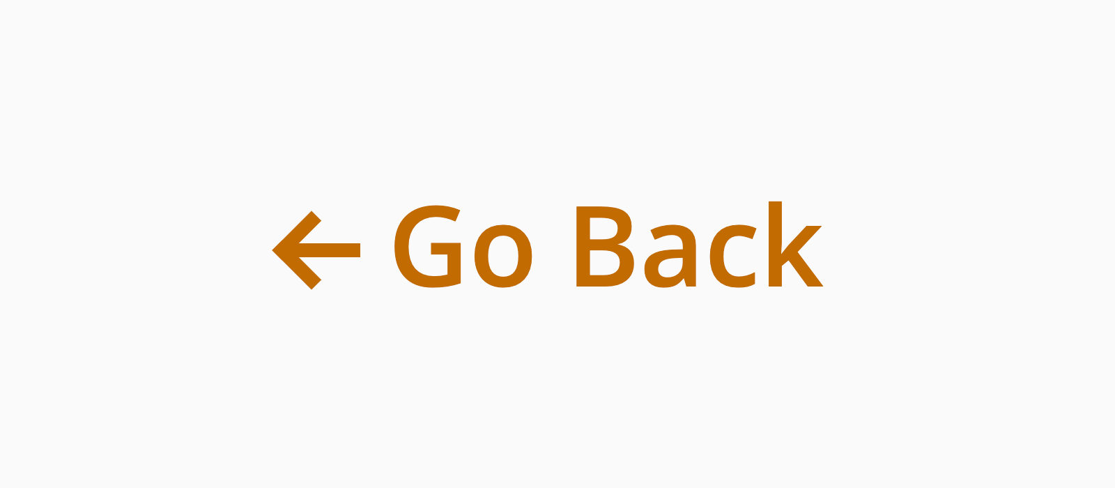
Needless to tell you that the end result was rewarding. The following is a screenshot:

Preliminary Styling
As anticipated, all the styling gravitates around a single tag, an <a> tag, so the markup is very minimalistic:
1<a class="go-back">Go Back</a>And the base CSS is not otherwise:
1.go-back {
2 color: #c16b00;
3 font-size: 16px;
4 font-weight: 600;
5 font-family: 'Open Sans', sans-serif;
6
7 /**
8 * If you set it to a value higher than the 'font-size',
9 * you will have to take account of the difference
10 * between the 'line-height' and the 'font-size'
11 * to vertically centre the arrow
12 * and align it with the text.
13 **/
14 line-height: 1;
15
16 /* Makes some place for the arrow */
17 padding-left: 15px;
18
19 /* The arrow will be absolutely positioned */
20 position: relative;
21}The Point
Imagine a transparent square with a border only on two adjacent sides. Now imagine to rotate the square so that the visible corner points west. Here you have in mind the point of a left arrow:
1.go-back::before {
2 border-color: #c16b00;
3 border-style: solid;
4 border-width: 0 0 2px 2px;
5 content: "";
6 display: block;
7 height: 6px;
8 left: 0px;
9 position: absolute;
10 width: 6px;
11
12 /**
13 * These two lines vertically centre
14 * the point of the arrow
15 */
16 margin-top: -3px;
17 top: 50%;
18
19 /**
20 * The arrow sprints to the left
21 * when the link is hovered
22 */
23 transition: left 0.1s;
24
25 transform: rotate( 45deg );
26 -webkit-transform: rotate( 45deg );
27}The Shaft
The shaft of our arrow is a plain segment, so we just need to draw a horizontal rectangle, give it a background colour, and place it in harmony with the point drawn before:
1.go-back::after {
2 background: #c16b00;
3 content: "";
4 display: block;
5 height: 2px;
6 left: 0px;
7 position: absolute;
8 top: 50%;
9 width: 11px;
10
11 /**
12 * We need to animate the shaft too,
13 * to be able to look at a moving arrow
14 */
15 transition: left 0.1s;
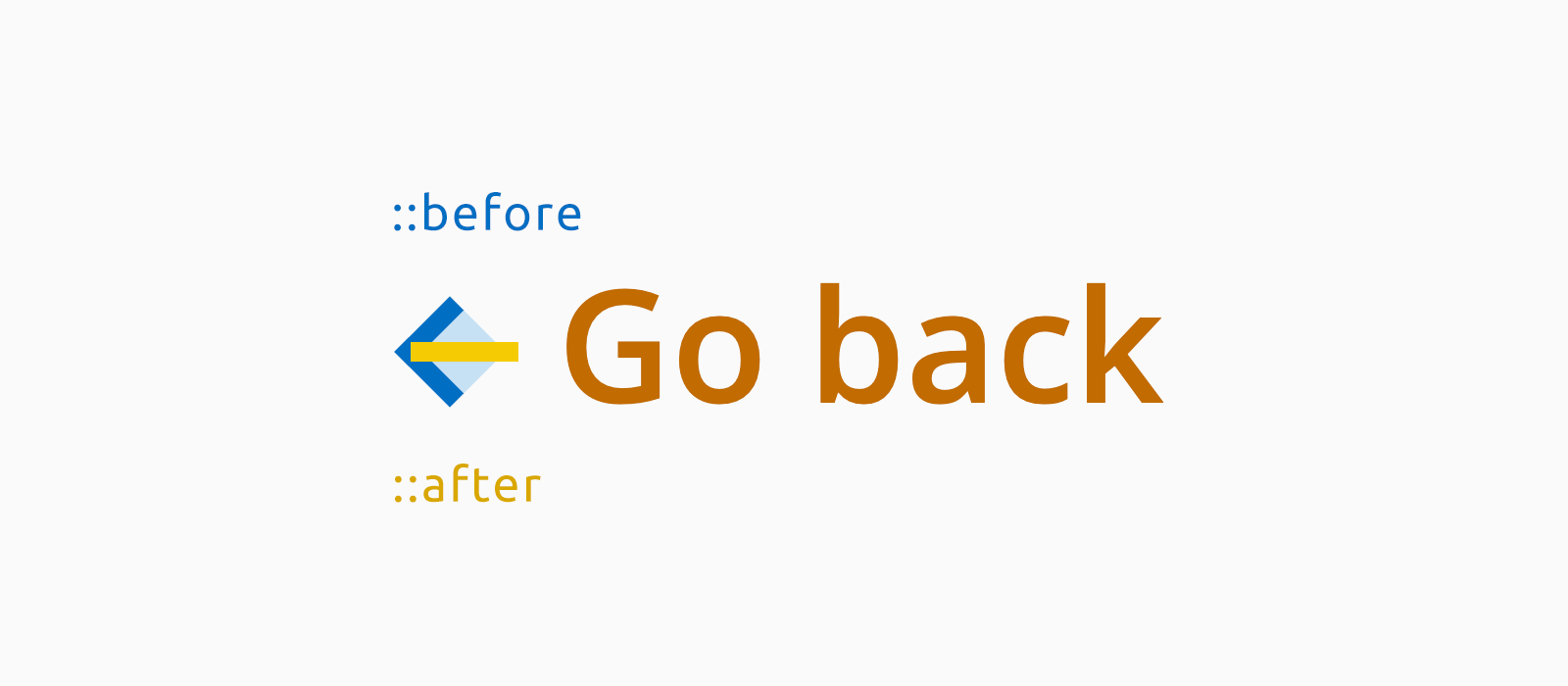
16}Just to leave very little to the imagination:

Have you noticed the square in light blue? It is a representation of the ::before pseudo-element, the element whose 2px-wide border plays the role of the point of the arrow.
Something is Missing
The drawing is complete, the arrow is visible, but when hovering the link nothing changes. That's because the ingredients for an :hover state are not all there, yet. We need a final rule:
1.go-back:hover::before,
2.go-back:hover::after {
3 left: -3px;
4}The Whole Cascade
1.go-back {
2 color: #c16b00;
3 font-family: 'Open Sans', sans-serif;
4 font-size: 16px;
5 font-weight: 600;
6 line-height: 1;
7 padding-left: 15px;
8 position: relative;
9}
10.go-back::before,
11.go-back::after {
12 content: "";
13 display: block;
14 left: 0px;
15 position: absolute;
16 top: 50%;
17 transition: left 0.1s;
18}
19.go-back::before {
20 border-color: #c16b00;
21 border-style: solid;
22 border-width: 0 0 2px 2px;
23 height: 6px;
24 margin-top: -3px;
25 width: 6px;
26
27 transform: rotate( 45deg );
28 -webkit-transform: rotate( 45deg );
29}
30.go-back::after {
31 background: #c16b00;
32 height: 2px;
33 width: 11px;
34}
35.go-back:hover::before,
36.go-back:hover::after {
37 left: -3px;
38}My goal on writing this code was to draw a plain go-back arrow without having to resort to JavaScript, since in my case only with some JavaScript I could have inserted a child tag into the <a> tag. Why a child tag? Because if we wanted to add a box-shadow to the arrow, or more generally, do any more complex styling, we would definitely need one. In such a case in fact, the arrow would take shape from the combination of three segments: two, the pseudo-elements of the child tag, would form the point, instead the third, the child tag itself, would act as a shaft.