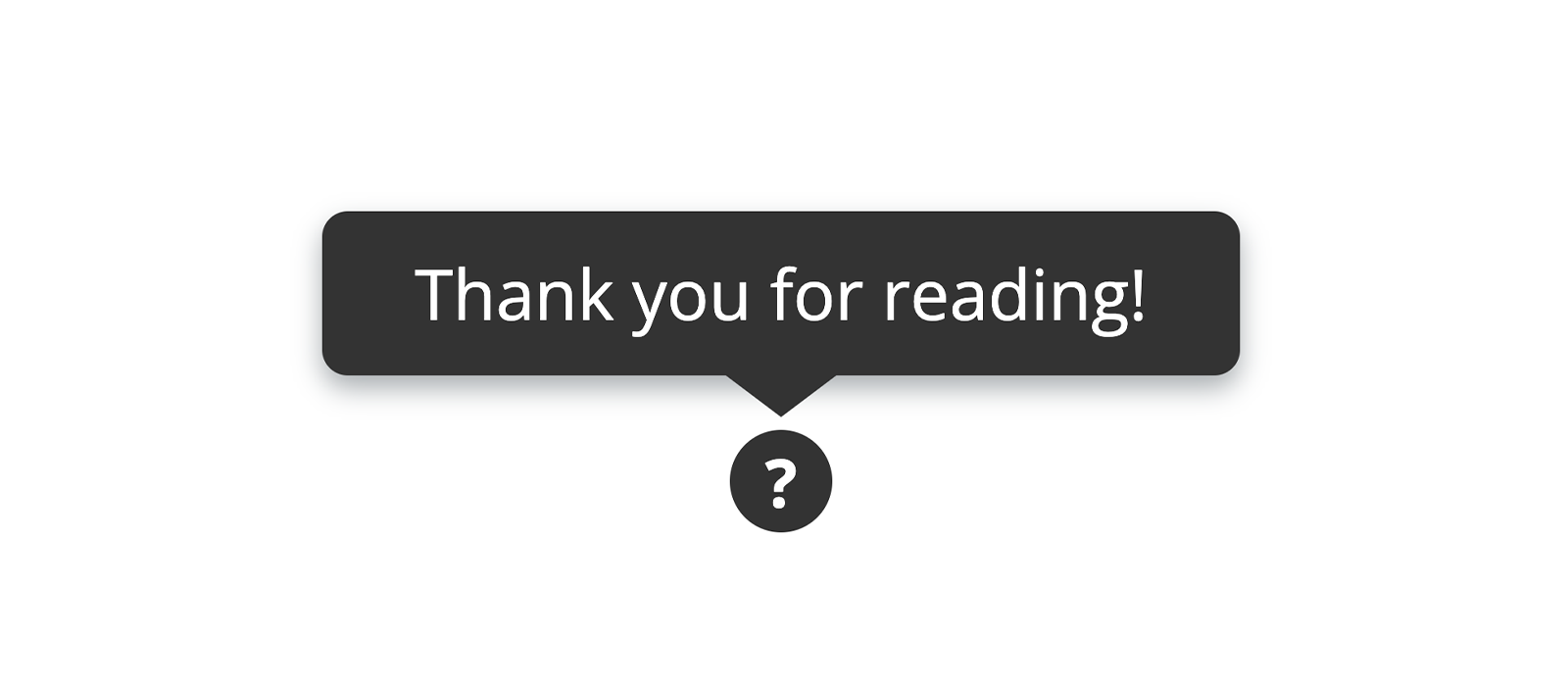
Drawing a Tooltip with CSS: Can a Border Give Shape to a Triangle?
A how-to on drawing a tooltip with CSS, and an aside on how a border can be used to shape a triangle.
Modern CSS helps greatly in streamlining the drawing of tooltips: if it wasn't for the flexbox layout we were still obliged to resort to tricks like a negative margin, to keep a group of elements neatly centred. But what about that little bottom triangle characterising the tooltip itself? Sometimes old solutions don't lose contemporaneity.
A Triangle from a Border
All right, with CSS a border can give shape to a triangle. But how?
A HTML element's border is not rendered by the browser as a whole. Actually, the border is made up of four distinct sections, each of which can have different characteristics. Moreover in the corners, where two sections of the border meet, the rendering is all but continuous.
If you draw a border enough thick, and you give each section a different colour, you will see what I'm talking about: four isosceles trapezoids composing the border.
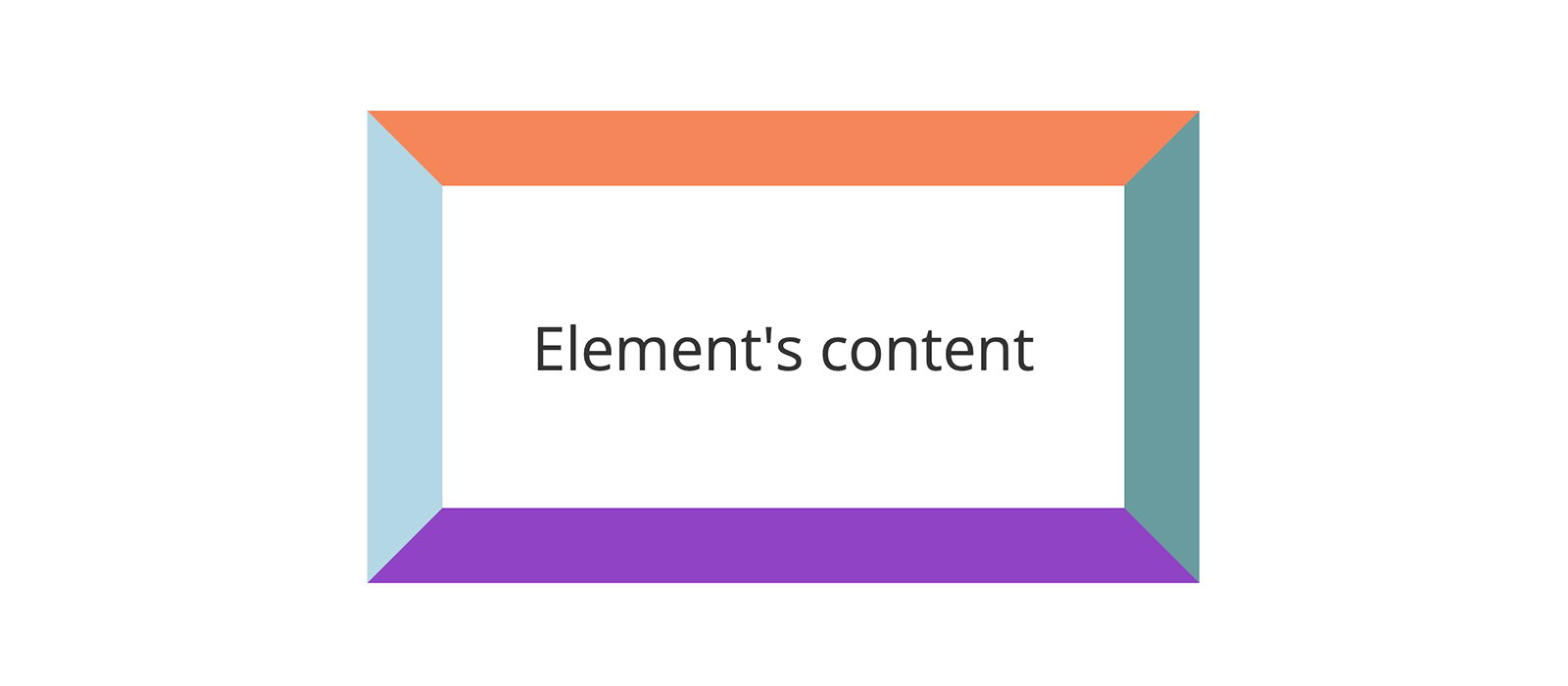
You may get the above result with a snippet of code like this:
1.sample-element {
2 border-top-color: coral;
3 border-right-color: cadetblue;
4 border-bottom-color: darkorchid;
5 border-left-color: lightblue;
6 border-style: solid;
7 border-width: 20px;
8}Have you glimpsed the triangle? Not jet? So try to make the HTML element collapse on itself by removing its content and padding, or alternately, setting its width, height and padding to zero.
Result: four triangles at our disposal.

The good news is that this technique is applicable to pseudo-elements too!
The Starting Point
After this short premise, we can start coding!
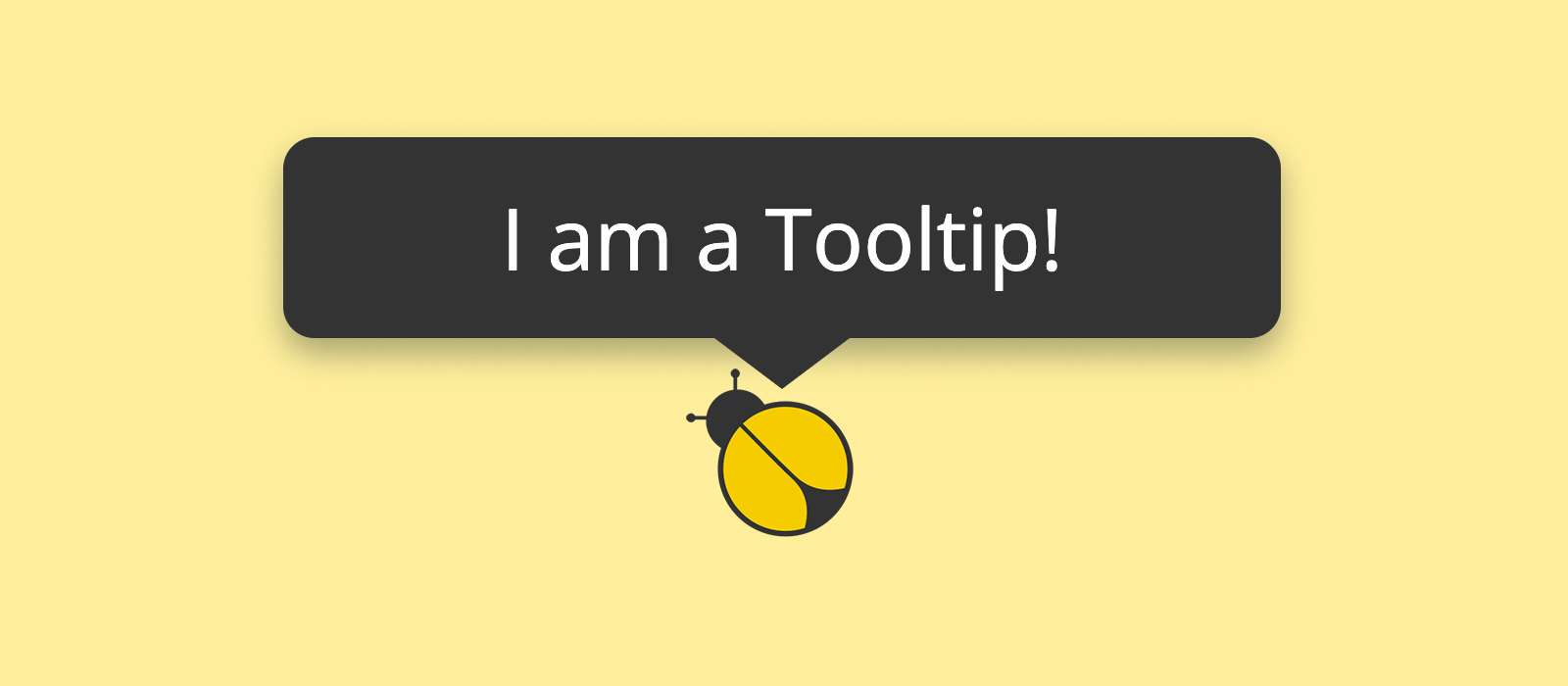
As it is usually a good practice to keep the markup minimal, we are going to draw everything from three <span>. Why not using the <div> element? Because the span element lets us include our soon-to-be tooltip in either inline and block elements without the risk of invalidating the markup.
1<span class="tooltip-wrapper">
2 <span class="tooltip">I am a Tooltip!</span>
3 <span class="help-point">?</span>
4</span>To start with, we write our first lines of CSS to shape a disk, with a question mark in the middle, out of the .help-point element:
1.tooltip-wrapper .help-point {
2 background-color: #333;
3 border-radius: 50%;
4 color: #fff;
5 cursor: default;
6 display: flex;
7 font-size: 0.65rem;
8 font-weight: bold;
9 height: 1rem;
10 width: 1rem;
11
12 /* Vertically centres the question mark */
13 align-items: center;
14
15 /* Horizontally centres the question mark */
16 justify-content: center;
17}This is the rendering of the code just written:

Shaping the Tooltip
The actual tooltip is composed of two parts:
- an absolutely positioned rectangle with a fixed width shaped out of the
.tooltipelement - an absolutely positioned triangle born out of the
.tooltip::beforepseudo-element by using the technique described at the beginning of the post.
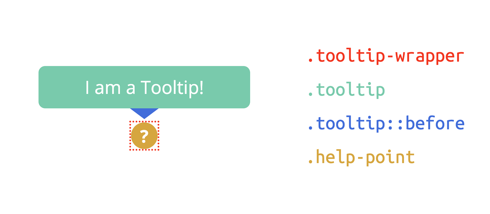
Since the .tooltip is absolutely positioned, the wrapper element will collapse to the size of the .help-point element. This way, when we apply some flexbox rules to centre the tooltip relative to the wrapper, the tooltip will be automatically centred relative to the .help-point element, too.
Here is the code:
1.tooltip-wrapper {
2 position: relative;
3
4 /**
5 * Horizontally centres the tooltip
6 * relative to .tooltip-wrapper.
7 */
8 display: inline-flex;
9 justify-content: center;
10 }
11 .tooltip-wrapper:hover .tooltip {
12 display: flex;
13 }
14 .tooltip-wrapper .tooltip {
15 background-color: #333;
16 border-radius: 4px;
17 box-shadow: 0px 2px 4px #07172258;
18 color: #fff;
19 display: none;
20 font-size: 0.68rem;
21 line-height: 1.35em;
22 padding: 0.5em 0.7em;
23 position: absolute;
24 text-align: center;
25 width: 7rem;
26 z-index: 1;
27
28 /**
29 * 100% of the height of .tooltip-wrapper
30 *
31 * 0.6em is the height of the triangle ( .tooltip::before )
32 *
33 * 2px is an arbitrary blank gap between
34 * the tip of the triangle and .help-point
35 */
36 bottom: calc( 100% + 0.6em + 2px );
37
38 /**
39 * Horizontally centres the triangle
40 * relative to .tooltip
41 */
42 justify-content: center;
43 }
44 .tooltip-wrapper .tooltip::before {
45 content: "";
46 display: block;
47 border-style: solid;
48 position: absolute;
49
50 /**
51 * Setting to 0 the bottom border's width
52 * makes sure the tooltip disappears
53 * even when the cursor moves upward,
54 * outside .tooltip-wrapper
55 */
56 border-width: 0.6em 0.8em 0;
57
58 /* We display only the top triangle */
59 border-color: transparent;
60 border-top-color: #333;
61
62 /* 100% of the height of .tooltip */
63 top: 100%;
64 }The Whole Cascade
Obviously there are variations to the design proposed in this post, but the basic concepts will keep being valid.
Just as a summary, the markup we started from is the following:
1<span class="tooltip-wrapper">
2 <span class="tooltip">I am a Tooltip!</span>
3 <span class="help-point">?</span>
4</span>And the tidied-up cascade of CSS rules used to style it is the one below — a good starting point to give life to something creative:
1.tooltip-wrapper {
2 display: inline-flex;
3 justify-content: center;
4 position: relative;
5 }
6 .tooltip-wrapper:hover .tooltip {
7 display: flex;
8 }
9 .tooltip-wrapper .tooltip {
10 background-color: #333;
11 border-radius: 4px;
12 bottom: calc( 100% + 0.6em + 2px );
13 box-shadow: 0px 2px 4px #07172258;
14 color: #fff;
15 display: none;
16 font-size: 0.68rem;
17 justify-content: center;
18 line-height: 1.35em;
19 padding: 0.5em 0.7em;
20 position: absolute;
21 text-align: center;
22 width: 7rem;
23 z-index: 1;
24 }
25 .tooltip-wrapper .tooltip::before {
26 border-width: 0.6em 0.8em 0;
27 border-color: transparent;
28 border-top-color: #333;
29 content: "";
30 display: block;
31 border-style: solid;
32 position: absolute;
33 top: 100%;
34 }
35 .tooltip-wrapper .help-point {
36 align-items: center;
37 background-color: #333;
38 border-radius: 50%;
39 color: #fff;
40 cursor: default;
41 display: flex;
42 font-size: 0.65rem;
43 font-weight: bold;
44 height: 1rem;
45 justify-content: center;
46 width: 1rem;
47 }