Flock: A Minimalist WordPress Theme for Bloggers
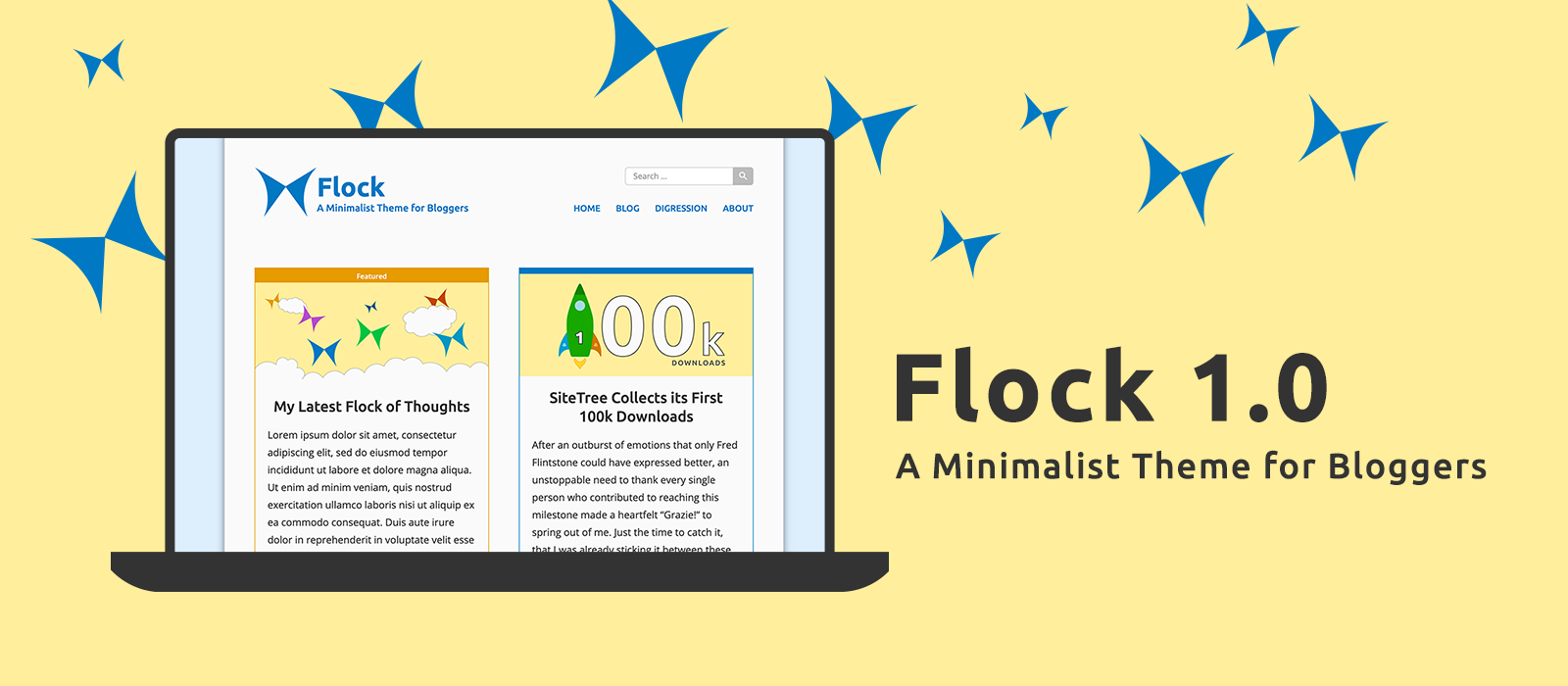
In its first iteration Flock is a bare-bones theme for personal blogs. Let me introduce it to you!

Flock can easily turn out to be a companion for those just starting out blogging as well as a complete answer for anyone seeking minimalism. Despite its being essential, it offers an acceptable degree of customisability. It is clean, functional and content-centric. Flock is a theme for personal blogs.
The development of Flock 1.0 has been a real gym, part because I never developed a theme intended to be released to the public before, but also because developing a non-custom theme has meant for me delving deeper into the ground of WordPress themes, and I really have to tell you that learning something new is like hugging a loved one, it is restorative.
Well, now let's go back to introducing Flock!
Packed with the Essentials
In its first iteration Flock is a bare-bones theme. Its likeness to this blog is noticeable, but actually, it's just an outward similarity, because Flock has much more functionalities than this blog has.
The following is a comprehensive summary of its features:
- Responsive layout with flexible header and footer sections.
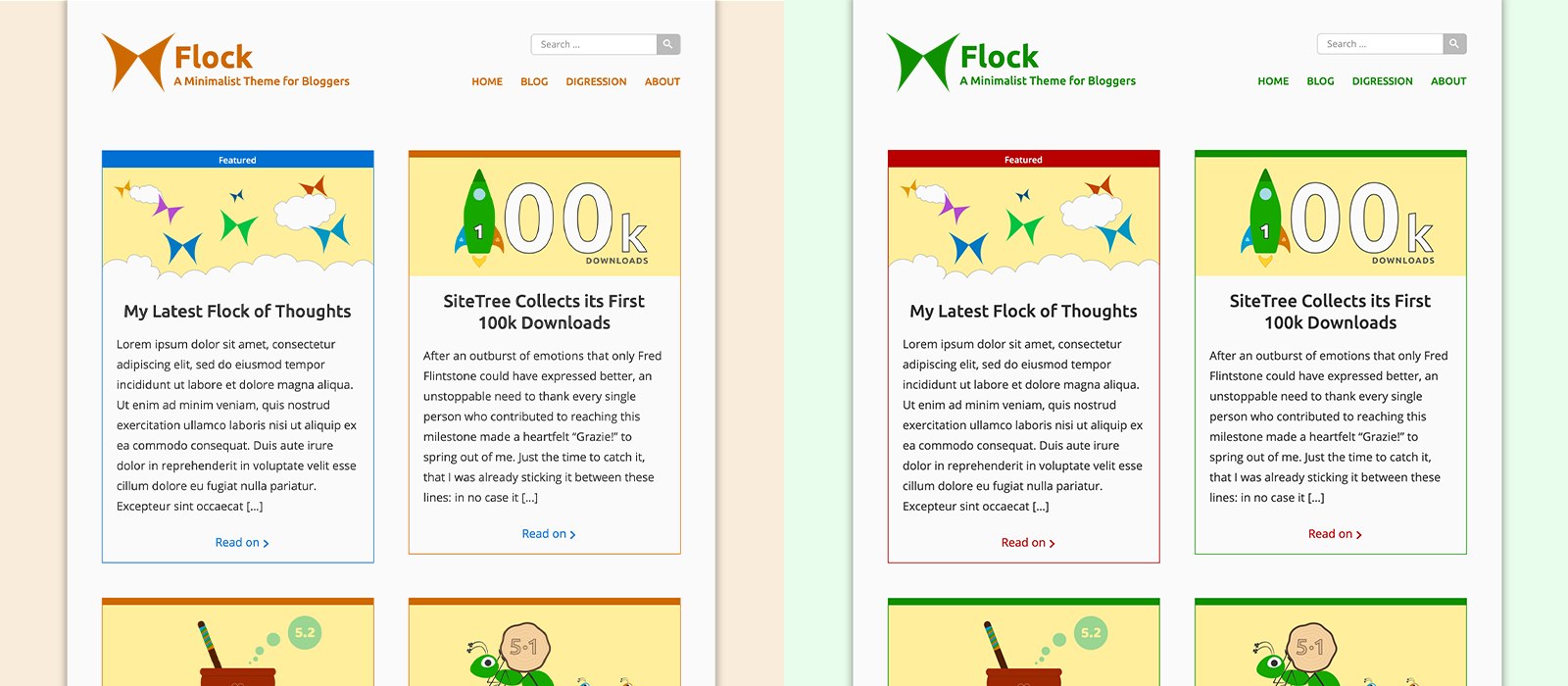
- Customisable base, alternate and background colours through the Theme Customise Screen.
- Optional custom logo and site tagline.
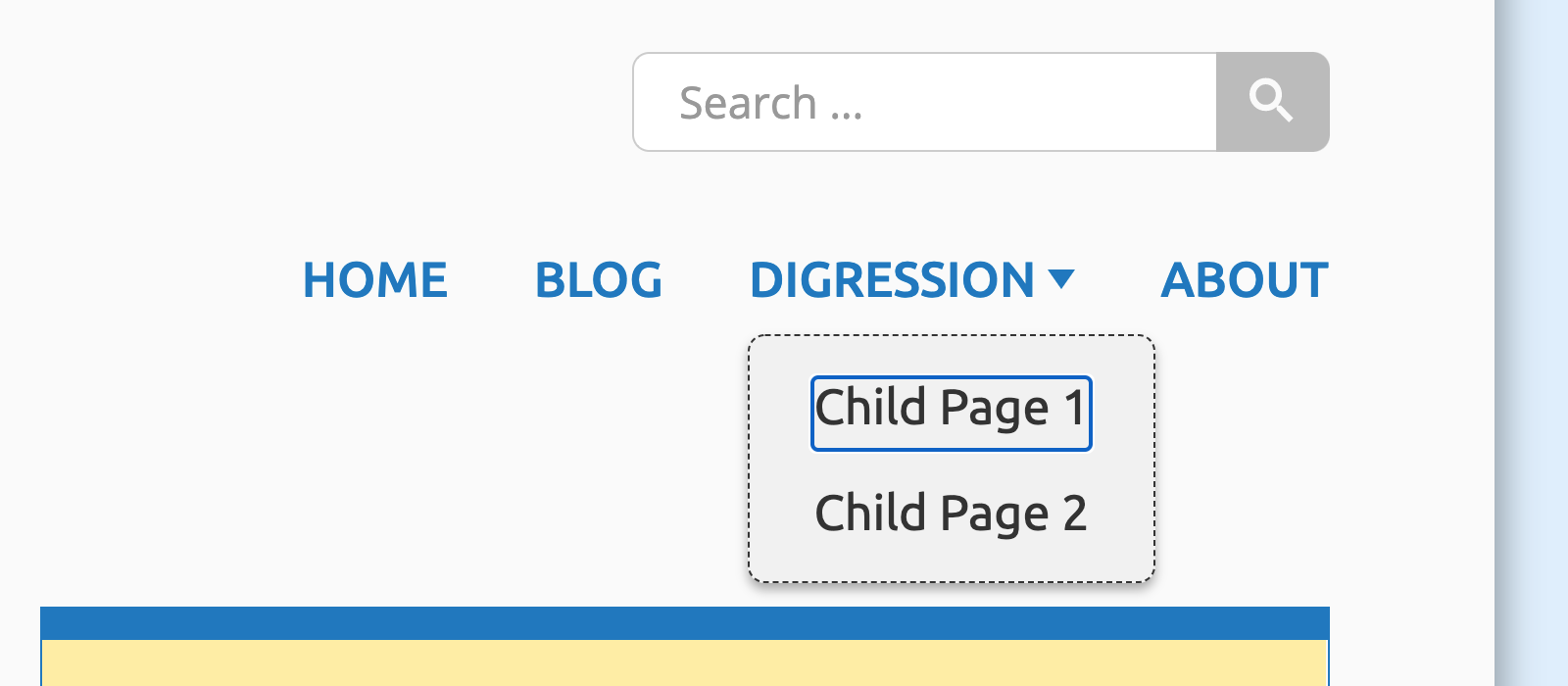
- Primary site menu with support for submenus, fully navigable by keyboard.
- Optional secondary menu displayable in the site's footer.
- Three contiguous widget areas in the site's footer.
- Always-at-hand search form.
- Support for featured images and sticky posts.
- Dynamic template for displaying search results, archive pages and author pages.
- Single post template ready to welcome multi-page posts, threaded comments and comments spread on multiple pages. The template doesn't lack for the ability to display post's metadata and for an adjacent-posts navigation section, too.
- Template for displaying 404 pages.
- Theme's typography matched by the Gutenberg editor's typography.
Colour it!
As mentioned above, the distinctive colours of Flock are not carved in the code. All the colours able to imprint on Flock your personality are customisable through the user interface provided by WordPress in the Theme Customise Screen.
They are three: the theme's base colour, the alternate colour — used to highlight post's metadata and sticky posts — and the theme's background colour. The latter is also used by Flock to paint the background of the navigation menu visible on mobile devices.

It is Accessible
For a theme to be listed in the WordPress.org directory, being accessible is a required feature. But I think that requirements shouldn't be the motivating reason for developing an accessible theme: caring about Accessibility, for the contemporary society, should mean being thoughtful about every single person's future, her own future.
If truth be told, this website has yet to improve its ability to be inclusive — it is just a matter of time, trust me — but Flock is born accessible.
Thanks to the folk behind the Twenty Twenty-One theme, Flock integrates a "Skip to content" button that is perceived by the visitor as the first focusable element when he navigates by keyboard (TAB key). Moreover, a script authored by me will let users of your Flock-powered website keyboard navigate the main menu even if it has not-readily-visible submenus.

Now that your flock of thoughts has an alternative medium to be introduced with to the world, don't refrain yourself from voicing it!