Building a Retractable Sidebar with React and CSS
In this post I go into the details of developing a retractable sidebar which opens on a blurred background, by helping you make yours the reasoning behind the development process.
In developing a RetractableSidebar component with React, there is something more important than the code on its own, even more important than the CSS trick we'll use to actualise the animation. This something is the understanding of how to carefully time the events at play. So, my goal with this post is to help you make yours the reasoning behind the development process, more than anything else, because once mastered that, the customisation of the RetractableSidebar component will flow naturally, by giving you an enjoyable development time.
Overview of the Example App
The example app we are going to use in this guide is very minimalistic: just a button that, when clicked, makes the sidebar to slide into view from the right. I think, however, that a screenshot can talk much better:
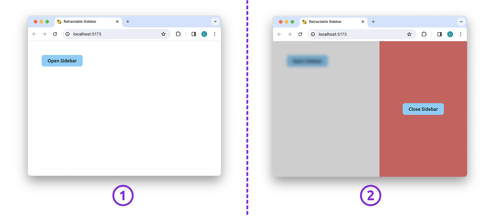
The user can hide the sidebar — something which is still done with a sliding animation — by clicking on either the close button or the blurred area outside the sidebar.
The key point in achieving such animation by keeping the React code minimal, is to leverage the power of CSS. In fact, the only task we will delegate to React is to toggle on and off a couple of CSS classes. The animation per se will be carried out by some plain CSS alone.
Just as a reference, the src folder of our example app will contain the following files:
1+ src
2 - App.tsx
3 - index.css
4 - main.tsx
5 + RetractableSidebar
6 - RetractableSidebar.module.scss
7 - RetractableSidebar.tsx
8 + styles
9 - _variables.scss
10 - variables-export.module.scssLet's Start with the 'App' Component
The App component is where it's located the state variable that keeps track of the "opened state" of the RetractableSidebar component, as you can read from the code below:
1import { useCallback, useState } from "react";
2import RetractableSidebar from "./RetractableSidebar/RetractableSidebar";
3
4
5export default function App() {
6 const [ isSidebarOpened, setIsSidebarOpened ] = useState( false );
7
8 const handleOnClickClose = useCallback(
9 () => setIsSidebarOpened(false),
10 []
11 );
12
13 return (
14 <>
15 <button onClick={() => setIsSidebarOpened( true )}>
16 Open Sidebar
17 </button>
18 <RetractableSidebar
19 opened={isSidebarOpened}
20 onClickClose={handleOnClickClose}
21 />
22 </>
23 );
24}The reason why the "opened state" is controlled from the outside of the RetractableSidebar component is that the change of such state originates from two distinct places of the app: from the inside of RetractableSidebar, when we click on the close button, and from the outside of RetractableSidebar, when we click on the open button, instead.
The CSS Trick Fuelling the Sliding Animation
In a nutshell, the sliding animation comes from transitioning the margin-right property of our sidebar.
To better understand what I'm speaking about, let's have a look at the following picture, which highlights the key parts of the user interface:
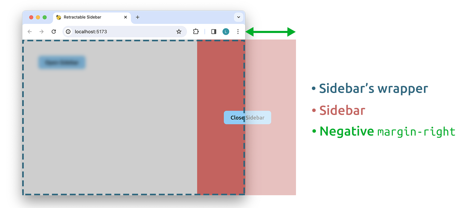
The negative margin-right is the very trick I was referring to in the introduction. By playing with its value, in fact, we are able to make the .sidebar to slide in and out of view. In general, the margin rule in CSS is one of those animatable rules which gives better cross-browser compatibility in the context of CSS animations, hence the reason for choosing it to achieve the sliding animation.
Styling the 'RetractableSidebar' Component
From the picture just seen, I guess you already have an idea about the JSX returned by the RetractableSidebar component, don't you? Well, our starting point is going to be the following code:
1import styles from "./RetractableSidebar.module.scss";
2
3
4export default function RetractableSidebar({
5 opened,
6 onClickClose
7}: {
8 opened: boolean;
9 onClickClose: () => void;
10}) {
11 // Here will go the magic.
12
13 return (
14 <div className={styles.wrapper}>
15 <aside className={styles.sidebar}>
16 <button>
17 Close Sidebar
18 </button>
19 </aside>
20 </div>
21 );
22}Nothing unusual, an <aside>, our sidebar, contained by a wrapper, the blurred area.
Here, the choice of using SCSS modules is a personal preference. You could as well rewrite the SCSS part of this guide by using a CSS-in-JS solution like that offered by the styled-components package. The result would be the same. If you are curious to know my reasons on favouring SCSS modules, I'll tell you that I like them better for three main points:
- they allow us to improve the organization of our code
- they help us to keep at bay the size of the JS file resulting from the build step
- the CSS file resulting from the build step can be cached by the browser
Going back to the styling of our component, the following is the CSS used by RetractableSidebar — I added a few inline comments to the main rules of the cascade:
1@import "../styles/variables";
2
3
4.wrapper {
5 background-color: #00000030;
6 backdrop-filter: blur(5px);
7 overflow: hidden;
8
9 // Initially, the .wrapper is hidden.
10 display: none;
11
12 // Moves the .sidebar to the right side.
13 justify-content: flex-end;
14
15 // Always on top of everything.
16 z-index: 1000;
17
18 // The following rules ensure that,
19 // whenever visible, .wrapper covers
20 // the whole viewport.
21 left: 0;
22 height: 100vh;
23 position: fixed;
24 width: 100vw;
25 top: 0;
26
27 &.visible {
28 display: flex;
29 }
30}
31
32.sidebar {
33 align-items: center;
34 background-color:indianred;
35 display: flex;
36 justify-content: center;
37 max-width: 50%;
38 width: $sidebar-width;
39
40 // The animation is achieved by
41 // playing with the value of margin-right
42 transition: margin-right #{$animation-duration-ms}ms ease;
43
44 // Initially the .sidebar is hidden.
45 margin-right: -$sidebar-width;
46
47 &.opened {
48 margin-right: 0;
49 }
50}The two utility classes you read in the code, .visible and .opened, are the very classes we will use later on to control the sliding animation.
Whilst, the file imported in the SCSS above is a stand-alone file of global variables. Most of the time, having a habit of saving frequently-used values into a separate file of global variables can go a long way. Often actually, the TypeScript code too, needs access to some of these values, so if they are saved to their own file, its easier to import them using a SCSS module — as we'll see.
To leave nothing out, our file of _variables.scss has the following content:
1$sidebar-width: 300px;
2$animation-duration-ms: 300; // millisecondsMaking the Sidebar to Slide into View
In the code below we use the opened prop to conditionally apply the .visible and .opened classes to our markup:
1import classNames from "classnames";
2import styles from "./RetractableSidebar.module.scss";
3
4
5export default function RetractableSidebar({
6 opened,
7 onClickClose
8}: {
9 opened: boolean;
10 onClickClose: () => void;
11}) {
12 // Here will go the magic.
13
14 return (
15 <div
16 onClick={onClickClose}
17 className={classNames(
18 styles.wrapper,
19 {
20 [styles.visible]: opened
21 }
22 )}
23 >
24 <aside
25 className={classNames(
26 styles.sidebar,
27 {
28 [styles.opened]: opened
29 }
30 )}
31 >
32 <button onClick={onClickClose}>
33 Close Sidebar
34 </button>
35 </aside>
36 </div>
37 );
38}Just an aside, the classnames tool used in the script is a third-party package you may want to eventually install via npm. If you never heard of it, don't worry, it's an utility as essential as easy to use. In the words of the developers who created it...
[classnames is] a simple JavaScript utility for conditionally joining classNames together.
If you try to use the app right now, you'll find out that there is a problem: when we click on the open button, the sidebar opens abruptly. The sliding animation doesn't work.
The reason for this behaviour is that, initially, the wrapper is hidden with a display: none rule. Generally speaking, when we turn off the display of an element, the webpage's markup is rendered as though the element did not exist. So, when we add the .visible class to the wrapper, it's as though we are instantly adding the wrapper to the webpage, by leaving no time for the animation to run.
Allowing the Animation to Run
The solution is to add the .opened class to the sidebar only after the wrapper is visible on the screen. In other words, the .visible and .opened classes must be added to their target elements during two separate renderings of the RetractableSidebar component. This can be achieved by using a state internal to the component and updating it in the callback of a useEffect() hook, like so:
1import { useEffect, useState } from "react";
2import classNames from "classnames";
3import styles from "./RetractableSidebar.module.scss";
4
5
6export default function RetractableSidebar({
7 opened,
8 onClickClose
9}: {
10 opened: boolean;
11 onClickClose: () => void;
12}) {
13 const [ isSidebarVisible, setIsSidebarVisible ] = useState( false );
14
15 const handleClose = () => {
16 setIsSidebarVisible( false );
17 onClickClose();
18 };
19
20 useEffect(() => {
21 if ( opened ) {
22 setIsSidebarVisible( true );
23 }
24 }, [ opened ] );
25
26 return (
27 <div
28 onClick={handleClose}
29 className={classNames(
30 styles.wrapper,
31 {
32 [styles.visible]: opened
33 }
34 )}
35 >
36 <aside
37 className={classNames(
38 styles.sidebar,
39 {
40 [styles.opened]: isSidebarVisible
41 }
42 )}
43 >
44 <button onClick={handleClose}>
45 Close Sidebar
46 </button>
47 </aside>
48 </div>
49 );
50}Summary of the Workflow Behind the Opening
In the end, the opening of the sidebar is the result of a thoroughly timed succession of events. Namely the following:
- The user clicks on 'Open Sidebar'.
- The components tree starts re-rendering consequently to the call of
setIsSidebarOpened( true ), triggered in theAppcomponent. - An
openedprop equal totrueis passed toRetractableSidebar, which as a result adds the.visibleCSS class to the<div>wrapping the sidebar. - The wrapping
<div>, and so the blurred area, appears in the browser. - While the rendering is still in progress, the callback of the
useEffect()hook is fired andsetIsSidebarVisible( true )is executed, thus triggering a new rendering of theRetractableSidebarcomponent. - Now
isSidebarVisibleistrue, and the.openedCSS class is added to the sidebar — the<aside>tag, in the JSX. - The sidebar slides into view.
The key point to take in mind is that the animation doesn't take place during the same rendering which makes the blurred area to show up. At the contrary, the two events are carried out during two distinct, consecutive renderings of the RetractableSidebar component. And that is the very reason why we can, as users, appreciate the sliding animation.
Fixing the Sidebar's Closing Animation
From what we have learned so far, should come with no surprise that the closing animation appears broken. In fact, a quick look at the handleClose() callback is enough to understand the cause: we are removing the .visible and .opened classes at the same time, thus leaving no useful time for the closing animation to run.
So, the problem is the same we encountered for the opening animation, and the solution is exactly the same as well: we have to remove the .visible and .opened classes during two distinct renderings of the RetractableSidebar component. However, there is a but. This time around the blurred area, the sidebar's wrapper, has to be hidden only once the animation has drawn to the end.
Let's take a quick look at the handleClose() callback:
1const handleClose = () => {
2 setIsSidebarVisible( false );
3 onClickClose();
4};In practice, what we have to do is to delay the call of onClickClose() for a time equal to the duration of the animation, because the rendering during which the .visible CSS class is removed from the wrapper element, is triggered in that very callback. Therefore, we have to let the global SCSS variable $animation-duration-ms to reach the TypeScript of our component. And to do that, we are going to use a separate SCSS module whose content is the following:
1@import "./variables";
2
3:export {
4 animationDurationMs: $animation-duration-ms;
5}With this file in place, we can now introduce the delay we were talking about by rewriting the handleClose() callback as done in this almost-final version of our RetractableSidebar component:
1import { useEffect, useState } from "react";
2import classNames from "classnames";
3import styles from "./RetractableSidebar.module.scss";
4import scssVariables from "../styles/variables-export.module.scss";
5
6
7export default function RetractableSidebar({
8 opened,
9 onClickClose
10}: {
11 opened: boolean;
12 onClickClose: () => void;
13}) {
14 const [ isSidebarVisible, setIsSidebarVisible ] = useState( false );
15
16 const handleClose = () => {
17 const timeoutMilliseconds = Number( scssVariables.animationDurationMs );
18
19 setIsSidebarVisible( false );
20 setTimeout(() => onClickClose(), timeoutMilliseconds );
21 };
22
23 useEffect(() => {
24 if ( opened ) {
25 setIsSidebarVisible( true );
26 }
27 }, [ opened ] );
28
29 return (
30 // Same JSX as before
31 );
32}Just a side note, the typecast in the handleClose() callback is necessary because setTimeout() expects its second argument to be of type number.
Summary of the Workflow Behind the Closing
Now that even the closing of the sidebar works as expected, I think it would be useful to summarise the succession of events occurring from the firing of a close action until the actual disappearance of the sidebar from the screen:
- The user clicks on either the 'Close Sidebar' button or the blurred area.
handleClose()is executed and theRetractableSidebarcomponent re-renders consequently to the call ofsetIsSidebarVisible( false ). Concurrently a timed callback,() => onClickClose(), is registered.- During the rendering, the
.openedCSS class is removed from the<aside>element, and the sidebar slides out. - 300 milliseconds later, the duration of the animation, the timed callback is executed. So,
onClickClose()is called and the components tree starts re-rendering consequently to the call ofsetIsSidebarOpened( false ), triggered in theAppcomponent. - An
openedprop equal tofalseis passed toRetractableSidebar, which as a consequence removes the.visibleCSS class from the<div>wrapping the sidebar. - The blurred area disappears.
The two distinct renderings of the RetractableSidebar component are, again, the stratagem which allows us to watch to the animated disappearance of the sidebar. And the delay between the two renderings is the keystone.
Fixing the Click-propagation Issue
There is only one last thing left to fix, a click propagation issue. I'll explain.
Have you tried to click on the red area of the sidebar? Well, as you can notice, because of event bubbling, the click event propagates up to the wrapping <div>, causing the sidebar to close when it shouldn't.
The solution is to stop the clicks from propagating beyond the <aside> element by calling the event.stopPropagation() method, like so:
1export default function RetractableSidebar({
2 opened,
3 onClickClose
4}: {
5 opened: boolean;
6 onClickClose: () => void;
7}) {
8 // ...
9
10 return (
11 <div
12 onClick={handleClose}
13 className={classNames(
14 styles.wrapper,
15 {
16 [styles.visible]: opened
17 }
18 )}
19 >
20 <aside
21 onClick={event => event.stopPropagation()}
22 className={classNames(
23 styles.sidebar,
24 {
25 [styles.opened]: isSidebarVisible
26 }
27 )}
28 >
29 <button onClick={handleClose}>
30 Close Sidebar
31 </button>
32 </aside>
33 </div>
34 );
35}Conclusion
Of course there are other approaches we can use to put in place the sliding animation, and a number of variations to the RetractableSidebar component, too. For instance, we might want to simplify the design by removing the blurred area altogether, and applying a box-shadow to the sidebar so as to make it look like it is floating over the page — in such case, we would need a way to intercept clicks falling outside the sidebar. That just to name one. But after all, only your imagination can draw a limit to how many are the ways to rethink the same piece of UI. What really matters now, however, is to take action!