How to Make a CSS-only Tooltip Appear from Any Direction
A guide on making a CSS-only tooltip to land from any of the four main directions by just changing a CSS class.
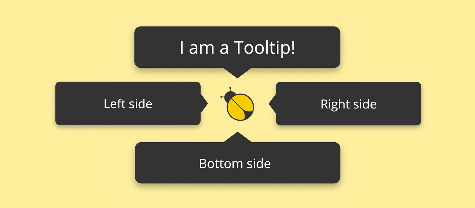
In this second post about tooltips I want to describe to you some new code developed on top of the CSS cascade I published about a month ago, and which I used to draw a CSS-only tooltip. I'm going to start with a slight refactoring and then add up on it new CSS rules, which will allow the tooltip to land from any of the four main directions by just changing a CSS class.
The Initial Codebase
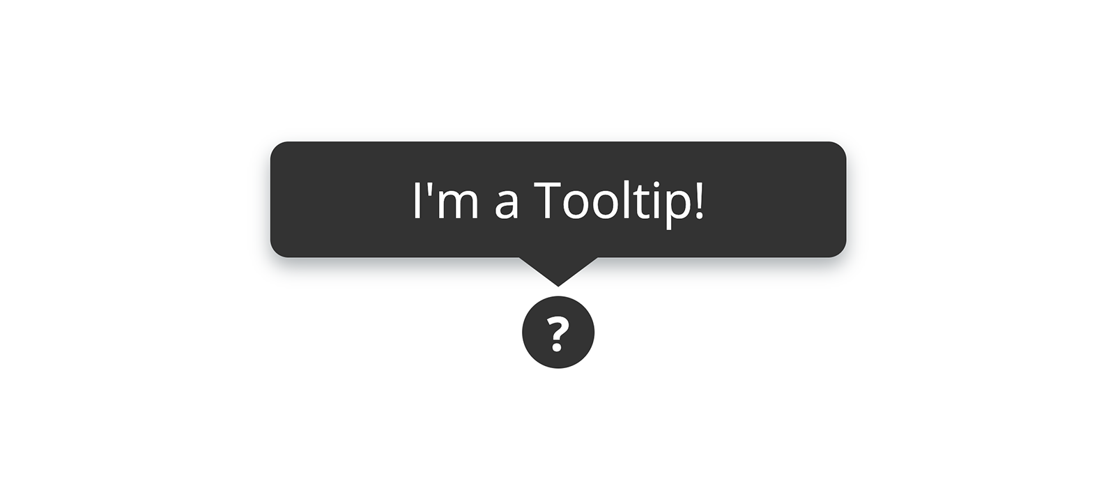
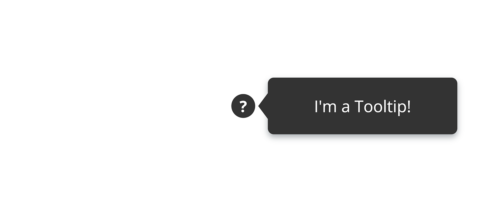
The CSS cascade I am talking about was the subject of my previous post (Drawing a Tooltip with CSS: Can a Border Give Shape to a Triangle?) where I described how the following minimalistic markup could look like a tooltip appearing on top of a disk with a question mark in the middle:
1<span class="tooltip-wrapper">
2 <span class="tooltip">I'm a Tooltip!</span>
3 <span class="help-point">?</span>
4</span>The whole cascade styling the above markup is the one below:
1.tooltip-wrapper {
2 display: inline-flex;
3 justify-content: center;
4 position: relative;
5 }
6 .tooltip-wrapper:hover .tooltip {
7 display: flex;
8 }
9 .tooltip-wrapper .tooltip {
10 background-color: #333;
11 border-radius: 4px;
12 bottom: calc( 100% + 0.6em + 2px );
13 box-shadow: 0px 2px 4px #07172258;
14 color: #fff;
15 display: none;
16 font-size: 0.68rem;
17 justify-content: center;
18 line-height: 1.35em;
19 padding: 0.5em 0.7em;
20 position: absolute;
21 text-align: center;
22 width: 7rem;
23 z-index: 1;
24 }
25 .tooltip-wrapper .tooltip::before {
26 border-width: 0.6em 0.8em 0;
27 border-color: transparent;
28 border-top-color: #333;
29 content: "";
30 display: block;
31 border-style: solid;
32 position: absolute;
33 top: 100%;
34 }
35 .tooltip-wrapper .help-point {
36 align-items: center;
37 background-color: #333;
38 border-radius: 50%;
39 color: #fff;
40 cursor: default;
41 display: flex;
42 font-size: 0.65rem;
43 font-weight: bold;
44 height: 1rem;
45 justify-content: center;
46 width: 1rem;
47 }And it produces this result:
The aim of this post is to enrich the CSS code just presented so as to be able to make the tooltip to slowly appear into view from a given direction by just adding .top, .bottom, .right or .left to the element .tooltip-wrapper.
The First Step is Refactoring
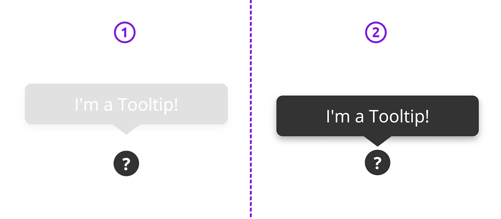
Not a big one, just a small refactoring to make the fade-in animation work without the need to resort to JavaScript.
The problem is this: as you can read from the code above, right now, the tooltip visibility is controlled by just a plain display rule. Generally speaking, when we turn off the display of an element, the webpage's markup is rendered as though the element did not exist. So it turns out that the display: none rule used to hide the tooltip would definitely be the breaking point of an animation based on transitioning the value of the opacity property.
So, the first thing to do is to remove the display: none rule from .tooltip and control its visibility by just playing with the value of opacity. However, this change alone isn't enough to make the tooltip completely disappear from the screen, because when opacity is equal to zero .tooltip can still receive mouse events, thus hindering the user from clicking on something which might be behind the tooltip itself. To get around this slight hindrance, the visibility rule comes to our rescue, and the small refactoring we need boils down to the following:
1.tooltip-wrapper {
2 /* ... */
3 }
4 .tooltip-wrapper:hover .tooltip {
5 /* display: flex; */
6
7 opacity: 1;
8 visibility: visible;
9 }
10 .tooltip-wrapper .tooltip {
11 /* ... */
12
13 /* display: none; */
14
15 display: flex;
16 opacity: 0;
17 transition: all 0.3s ease-in;
18 visibility: hidden;
19 }
20 .tooltip-wrapper .tooltip::before {
21 /* ... */
22 }
23 .tooltip-wrapper .help-point {
24 /* ... */
25 }The tooltip is still working as before, the only thing changed is that the tooltip no longer appears abruptly into view, now it discloses itself to the user with a fade-in animation.
As anticipated, the main code just refactored isn't going to undergone other changes, what we want to do instead, is to write some new code in such a way that it can be applied to our markup through the addition of a CSS class — we want to make our tooltip configurable.
Appearance from the Top
With a little trick, we are going to improve how the tooltip appears into view. Right now it just fades in. What if we make it to "land from the top" while it fades in? I think the animation would gain in beauty, don't you guess so?
All right, no more words, just a margin-bottom: if we distance .tooltip a little bit more from .help-point and then we gradually reduce that gap to zero as the mouse's pointer hovers the .tooltip-wrapper, we hit the target. The code needed is minimal:
1.tooltip-wrapper.top .tooltip {
2 margin-bottom: 8px;
3}
4.tooltip-wrapper.top:hover .tooltip {
5 margin-bottom: 0;
6}To appreciate the animation we just have to add the class top to the .tooltip-wrapper element.
The margin-bottom property is automatically animated thanks to the fact that we applied the transition rule to all the properties of .tooltip which change in value during the hover event:
1.tooltip-wrapper .tooltip {
2 /* ... */
3
4 transition: all 0.3s ease-in;
5}Appearance from the Bottom
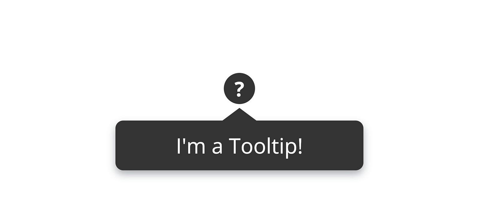
To make the tooltip appear from the bottom by adding the class .bottom to the .tooltip-wrapper element, we need very little code, because all we have to do is to reposition .tooltip (the rectangle composing the tooltip) and .tooltip::before (the small triangle characterising the tooltip). Obviously the triangle must also be rotated by 180 degrees to make it point upward:
1.tooltip-wrapper.bottom .tooltip {
2 /**
3 * 100% of the height of .tooltip-wrapper
4 *
5 * 0.6em is the height of the triangle ( .tooltip::before )
6 *
7 * 2px is an arbitrary blank gap between
8 * the tip of the triangle and .help-point
9 */
10 top: calc( 100% + 0.6em + 2px );
11 margin-top: 8px;
12}
13.tooltip-wrapper.bottom:hover .tooltip {
14 margin-top: 0;
15}
16.tooltip-wrapper.bottom .tooltip::before {
17 transform: rotate( 180deg );
18
19 /* 100% of the height of .tooltip */
20 bottom: 100%;
21}There is a but: if you take a look at the code we started from, the absolute positioning of .tooltip and .tooltip::before is controlled respectively through the bottom and the top properties. So, to let the above code work without unexpected behaviours, we need to reset these two properties to their default values. This keeps being true even when the tooltip appears from the right or the left, the reset must work in all cases except when the class top is added to the .tooltip-wrapper element:
1.tooltip-wrapper:not(.top) .tooltip {
2 bottom: auto;
3}
4.tooltip-wrapper:not(.top) .tooltip::before {
5 top: auto;
6}Appearance from the Right
For the tooltip to appear from the right we need a little bit more code, because we don't have to only reposition .tooltip and .tooltip::before, but we also have to align those elements vertically relative to either .tooltip-wrapper and .help-point:
1.tooltip-wrapper.right,
2.tooltip-wrapper.left {
3 /* Vertically centres .tooltip */
4 align-items: center;
5}
6.tooltip-wrapper.right .tooltip,
7.tooltip-wrapper.left .tooltip {
8 /* Vertically centres the triangle (.tooltip::before) */
9 align-items: center;
10
11 /* We limit the height to make the tooltip look nicer. */
12 min-height: 2.5em;
13}
14.tooltip-wrapper.right .tooltip {
15 left: calc( 100% + 0.6em + 2px );
16 margin-left: 8px;
17}
18.tooltip-wrapper.right:hover .tooltip {
19 margin-left: 0;
20}
21.tooltip-wrapper.right .tooltip::before {
22 right: calc( 100% - 0.5em - 0.25px );
23 transform: rotate( 90deg );
24}You might be wondering from where that 0.5em in the calc() operation comes from. And you might be justified to be perplexed.
When we rotate the triangle by 90 degrees, because the height and the base of the triangle are not equal in value, the triangle undergoes a translation too. The latter is a side effect of the automatic vertical alignment achieved through the flexbox rule align-items: center. It follows that if we applied only right: 100% (where 100% is relative to the width of .tooltip) there would be a small blank gap between the triangle and the left side of .tooltip:
right: 100%.However, you don't need to roll the dice to found out what the length of that small blank gap is. You just have to use the following empiric formula:
1H = height of the triangle
2B = base of the triangle
3
4GAP = ( B - H ) / 2;In fact, in our example, since B = 1.6em and H = 0.6em, the length of the blank gap is exactly equal to 0.5em.
The 0.25px included in the same calc() operation is just a correcting factor: if we remove it, the blank gap would still be visible while the animation is running, although only as a very thin flickering line which just a trained eye would glimpse.
Remember, bugs are there to keep our creativity fit!
Appearance from the Left
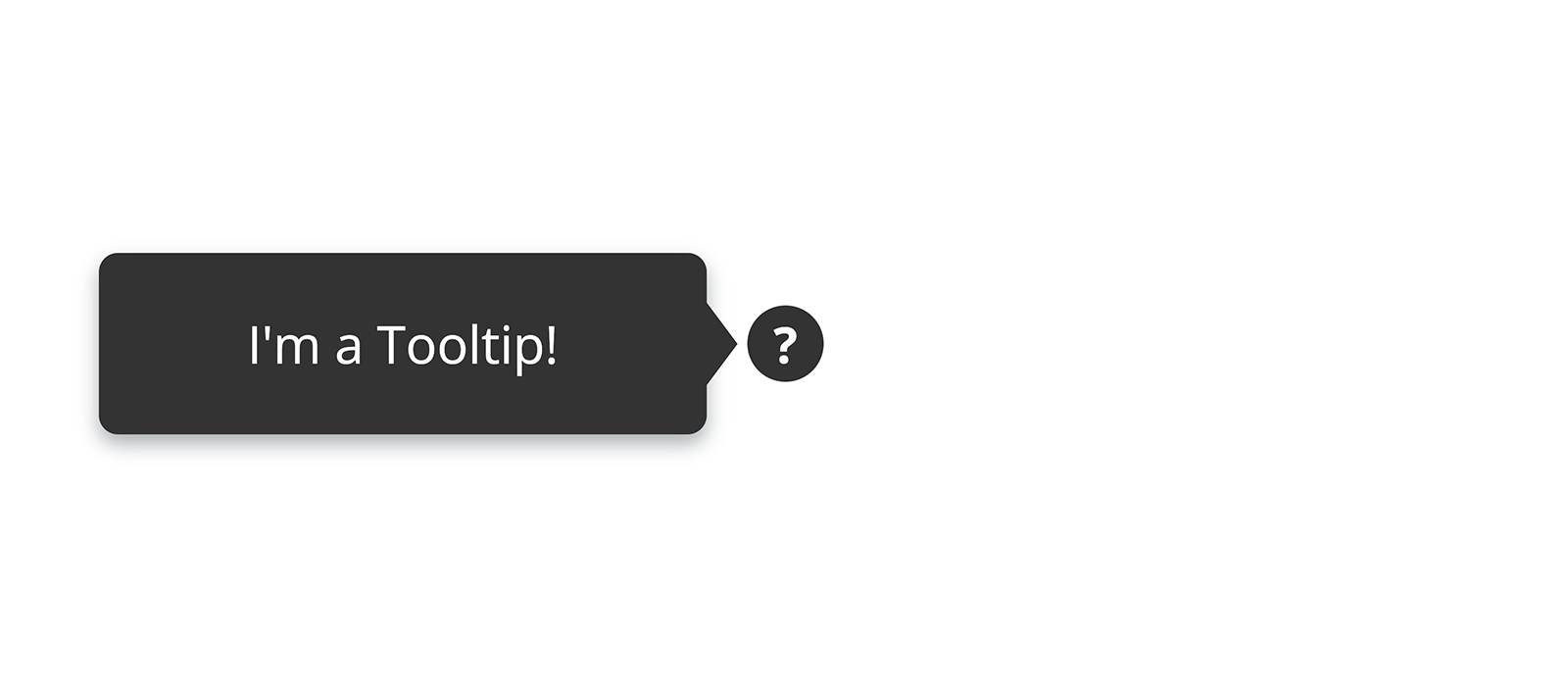
As you might have noticed from the section above, some of the rules written for the appearance from the right are the same, and even the reasoning is the same, the only thing changing is the direction. So the code is basically the one just seen, but mirrored:
1.tooltip-wrapper.left .tooltip {
2 right: calc( 100% + 0.6em + 2px );
3 margin-right: 8px;
4}
5.tooltip-wrapper.left:hover .tooltip {
6 margin-right: 0;
7}
8.tooltip-wrapper.left .tooltip::before {
9 left: calc( 100% - 0.5em - 0.25px );
10 transform: rotate( -90deg );
11}We finally have all the code needed to make the tooltip appear into view from the direction specified by the CSS class we add to .tooltip-wrapper. For instance, the following will produce a tooltip appearing from the left:
1<span class="tooltip-wrapper left">
2 <span class="tooltip">Thanks for reading!</span>
3 <span class="help-point">?</span>
4</span>